Merry Christmas from sunny Singapore! Started this post a while ago, wrote the bulk yesterday, might as well add a few more sentences and publish it on Christmas. Also, sorry, bad title puns again.
Drag-and-drop is a cute extension of the physical paradigm that works particularly well on touch devices for obvious reasons. It’s naturally suited to tasks where user-defined sorting of some kind is required. It’s also a great way to show off and engage users by creating something fun to play with: anyone who has ever interacted with a draggable element has pulled it randomly around the screen while savoring that rare sense of control over the interface, no matter how superficial. I’m fond of it, especially for the analogue sense it brings to digital interactions.
Problems arise when this control method is applied indiscriminately to content of all sizes and types, without regard for screen size, page length or consistency. Users get tired when drag-and-drop is unwieldy, has to traverse large distances, or if intermediate/drop behavior isn’t consistent with expectations set by other sites and applications. As an example, let’s look at LinkedIn, the website that reminded me to write this post today – although LinkedIn is by no means the sole offender.
Aside: I appreciate that LinkedIn is constantly experimenting with their interface – it’s very nice to see that they’re continually striving for improvement.
They’ve made a big change to their Edit Profile page recently – or maybe I was subject to a variation in an A/B test, we’ll never know. But to reorder entries on the profile I now drag and drop chunks of employment history etc. around. (But only positions I currently hold can be moved – another frustration that took a while to understand.)
I can be verbose in written communication, use bulleted lists, and have a lot of media on entries like those for illustration or design. These mean that the height of the draggable element becomes far too unwieldy for effective manipulation. Below is a screenshot of a reordering attempt. The element is too large to easily move, and it’s made worse by frustrating intermediate behavior that makes it hard to do what I want even if I manage to move the element.
 This particular drag-and-drop implementation also doesn’t allow me to just move the element roughly to where the target destination is – a behavior I expect since the only possible action is a crude swap and no finer control is needed. Instead, I have to align the top of the element with the top or bottom of the target to bump the target into the spot where my original element was.
What if I want to move the element to a target spot far away on the page, beyond my screen boundaries? Now the user is forced to perform an awkward shuffle that involves
- bumping the element against the edges of the screen to force scrolling (slow, and finding that exact spot is an exercise in precision pointer manoeuvring)
- holding the element down while scrolling with a wheel, keys or another finger, and hoping that the element follows along or at least reappears when the cursor is moved (which doesn’t always happen, forcing the user to try method 1 again)
If my finger slips – possible for users with poor motor control – or if I get to my destination and the draggable element has been lost somehow, I have to perform the dance all over again.
Let’s have a quick video example of said dance, this time on the website I first ran into the issue on, WordPress. WordPress has used drag-and-drop in their widgets page for quite a long time – you drag options from a pool of available widgets to an “active” zone, which enables them on your blog. This worked very well at first, but as the list of available widgets grows ever-longer, adding widgets has now become a big chore: good luck to you if you select a widget at the bottom of the list.
The problem is complicated once we throw accessibility into the mix (as always!) – say for instance you’re me with my terrible eyesight and have your browser zoom set between 150-175% by default. Working sometimes with Magnifier open and docked, I have at worst 11.5″ of screen real estate on an already-small 13″ 1280×800 screen. The following is a screenshot of my entire browser window at my normal zoom levels: the draggable element is too large to even fit on the screen.

On drag-and-drop pages where I have to traverse large screen distances or work with tall elements, I basically zoom out to 50% or less, do all my edits there, then restore to my usual 150%. It is incredibly frustrating.
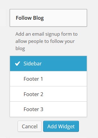
There are a few solutions to drag-and-drop usability problems. The most obvious is to add a different method of control. Try for instance up/down buttons that reorder elements in a list. WordPress has actually done something about the problem (slipped in so quietly that I just found out 30 seconds ago). Widgets can now be added by clicking on their titles, which brings up a menu allowing you to select where they should go, followed by an Add Widget button.
If you want to keep the fun and impressiveness of drag-and-drop, there are ways to do it in a manner considerate of the fact that not all users have the same computing setup as the developer does. Some possibilities:
- shrink elements when they are picked up
- have a little schematic where changes can be made and reflected on the main content
- drop targets that scroll together with your position on the screen so that they are always visible
Drag-and-drop is a very nice user interface touch in my opinion. When used well it adds fun, simplicity and a deliciously analogue tactility (which I love), enabling users do what they want faster and more easily. But care needs to be taken to ensure it doesn’t become a drag on the overall experience.
A few more pieces on accessible design: designing with accessibility in mind, a site against low contrast, a very short blog post/comment thread on designing for poor motor control (there seems to be a dearth of posts on this topic).

Re wordpress issue before the fix – what do you think about allowing the side elements (ie. the list of widgets) to be scrollable independent of the dropbox on the right?
hey – sorry, I only saw this now for some reason. I think that’s a lovely fix as well, though I’m not immediately sure giving it cursory thought (plus with the mind on the problem of free will instead…) if this is a solution that can be used across all screen widths. I think it’s a great idea, though; I’d probably also hide the help text (or collapse it into a (?) icon) to save on screen space if that were a necessity.